
The Making of Study of a Cluster of Grapes


Why Green Grapes?
When a painter chooses a subject to paint, it’s because there is something they see there that they find irresistibly beautiful. If someone asks me why I chose this or that subject or reference, the answer is usually going to always boil down to the same: because I like it! I love it! It’s beautiful to me. So when I’m selecting an image for study I like to ask myself three main questions:
Why do I like this? or Why does this catch my attention?
What makes this image work? Why is it beautiful?
How can I emphasize that or make it the focal point by being selective about the information I put in and leave out?
It’s usually in those little things that the untrained eye doesn’t notice, like the structure of the negative shapes, the light wrapping around the form, the proportions of light and shadow.
So why did I choose to paint a boring bunch of grapes? One, because they’re delicious.
But mainly, these grapes struck me because of the rhythm, the flow underlying the forms that makes this fruit feel alive even though it’s just a photo. The soft light wrapping around just reiterates that lovely gesture. If you would indulge me for a moment I’m about to geek out!

Notice how the lit up side of the grapes curve outward from the stem in the middle (the one that extends from the top) which forms something of a vertical axis line around which the weight of the grapes are centered. That gestural line formed by the grapes curving down and out I would say is the main gestural line, as that’s where the visual weight lies. It reaches toward the viewer ever so slightly and is illuminated by our source light while the other half curving out and down to the opposite direction is receding into shadow away from us and our light source. This is like the secondary gestural line that supports the primary.
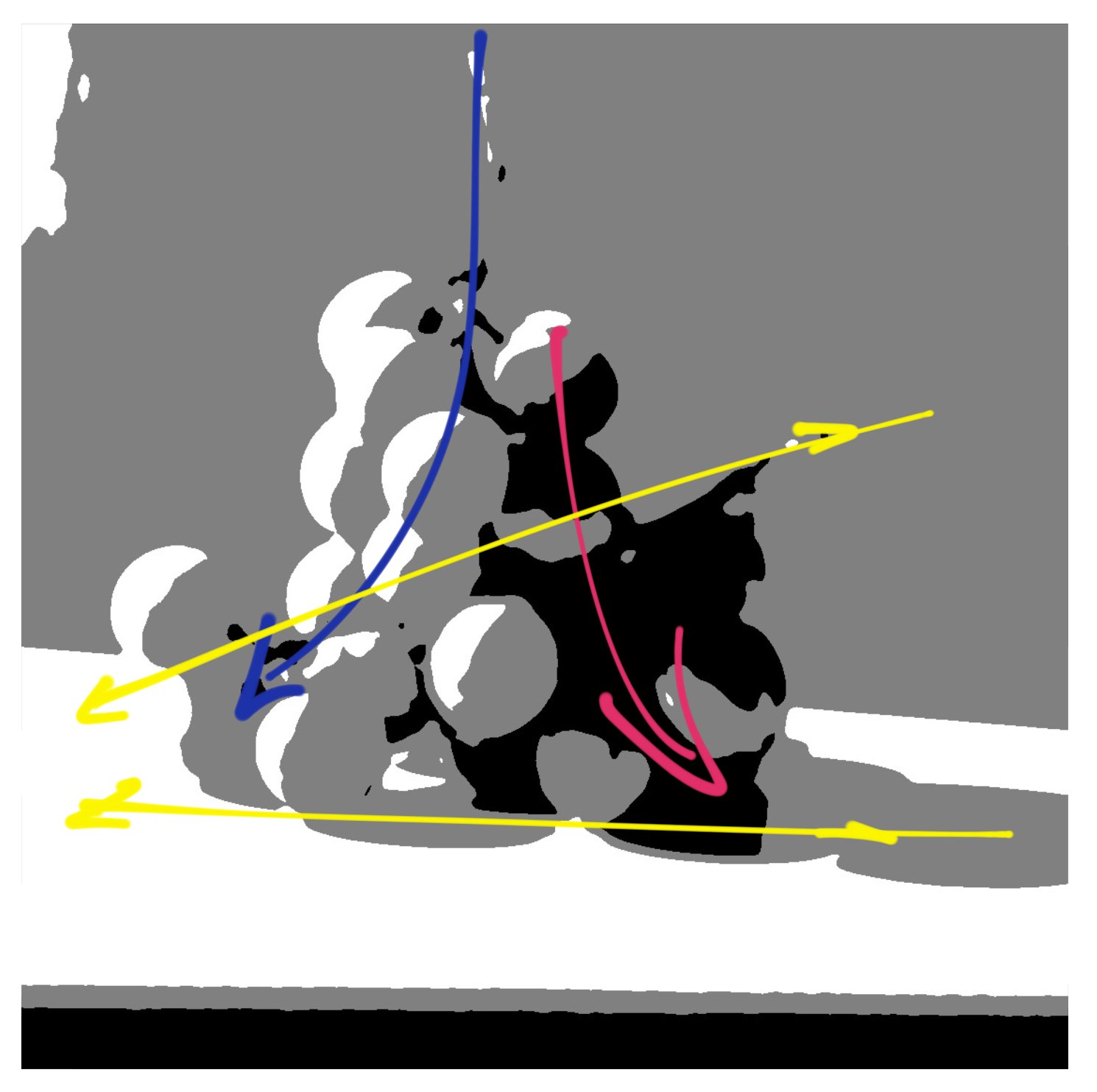
simplified version
We have these two curves supported by and balanced by some straight lines: the table that it rests on and the diagonal axis of the second stem.
Subsurface Scattering
Secondly, grapes have a texture to them that engages the light in a somewhat anomalous way, which makes for a very fascinating study. The specific phenomenon in question is called subsurface scattering.
The way light bounces off an object will determine how we are perceiving that object with our eyes. Subsurface scattering occurs when some of the light rays hitting a translucent object penetrate through the thin surface of the object, interacting with the material inside, and bouncing off in a different direction than where they entered. Essentially, objects with such a surface will not merely reflect light, but capture it.
You can see this in action when you put your hand up to direct sunlight in an otherwise dark room (eliminating secondary light sources). In the below example you can see this phenomenon extremely clearly; the light penetrates the thin top layer of skin (the epidermis), interacts with the capillaries underneath ( blood vessels), and bouncing off and out again to our eyes which perceive a red-orange light. You may have rightly guessed that you’d see less subsurface scattering with darker skin tones!

subsurface scattering in skin
The rim-like and vibrant glow to me is quite beautiful, as it just demonstrates those wonderful complexities of the natural world. Needless to say, the way light interacts with different materials is an essential component to keep in mind in order to maintain a greater sense of realism, and is an exciting subject of study for me.
Ok, I promise I’m done being a total nerd! Now I will write briefly about the techniques I used throughout the development of this painting.
Painting Process
Since this is an alla prima painting (wet-on-wet or direct painting), I’m starting by toning the canvas with a very thin wash that’s basically almost the same color as what my background will be. I want this wash to dry pretty fast since if it remains too wet while I’m painting on top, the purity of the subsequent colors will be compromised. True alla prima painting is painting with minimal solvents (which thins the paints) if any at all, but I prefer to start with a toned canvas rather than a white one, so I’m cheating a bit here >.<
Next I’m lightly sketching in my grapes with a dark brown and a small flat brush so I can keep my lines pretty thin. Once again, this deviates slightly from conventional alla prima where a more loose, direct method of laying down shapes rather than lines is encouraged. I often like to combine different methods rather than follow strict conventions! Plus, sketching it out beforehand helps me stay on track whenever I do start putting those large shapes down.


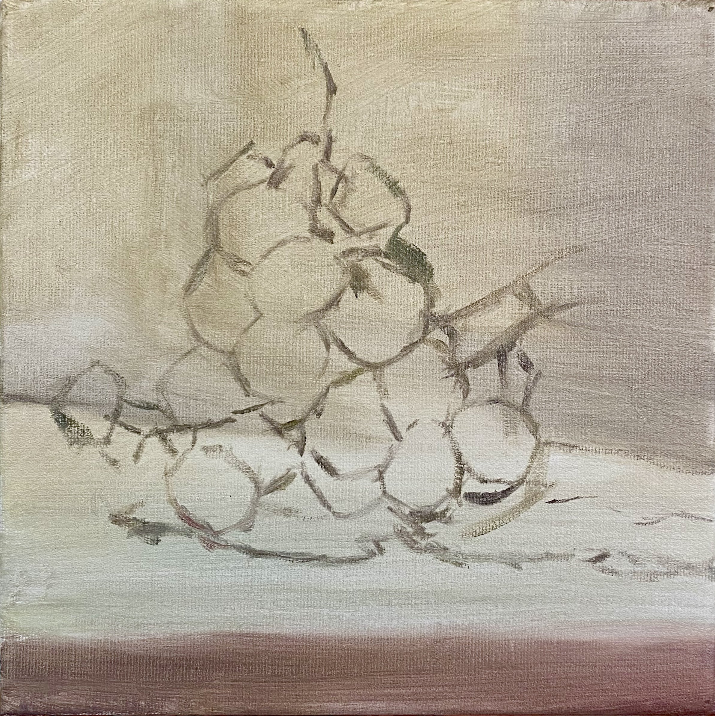
As such, you can see here I’ve begun to lay down some shapes and values, still keeping those gestural rhythms in mind as I think about my dark and light mass. I start with a much more toned down value range; notice how the grapes look much darker in the first image. I’m also making sure my shadows are relatively cool, adding in a tinge of ultramarine blue and cool gray to subdue the colors.
This is because, to achieve that luminous sub-surface scattering illusion like I talked about earlier, I want each individual grape in my light mass to have a wider range of value across the form. My mid-tones will end up being pretty dark while my highlights very light, as I want that side to have the highest contrast as our area of interest.
Additionally, the light side is considerably warmer, a sort of yellow-green, while the bluish hue of the grapes in shadow will have the appearance of receding away from the viewer toward the backdrop, so that introduces some atmospheric perspective.
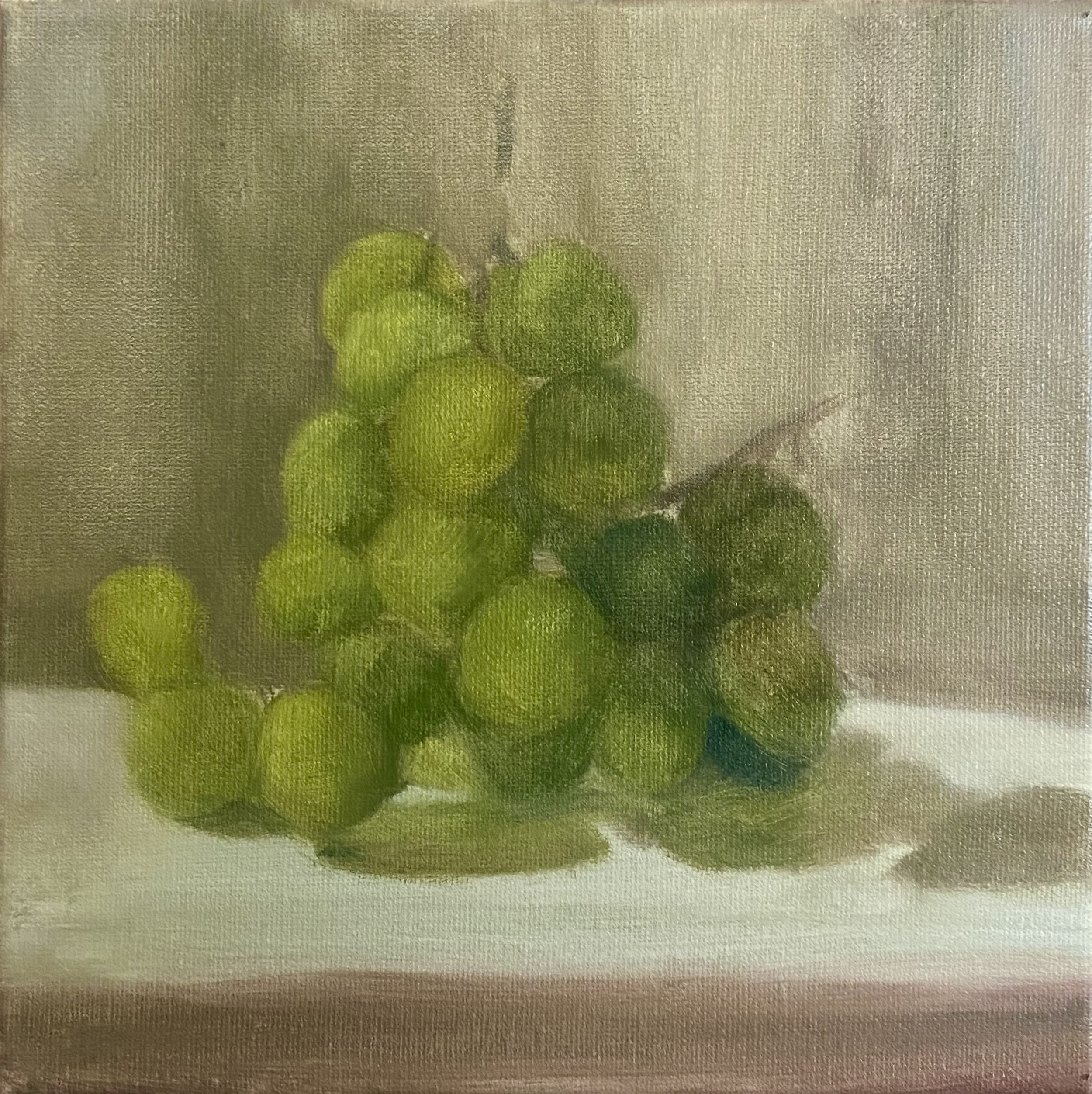
After I get the basic shapes and value groups down, I start to refine the painting with more detail, establishing my background and context a bit more so that I can get a better judgement of how much more I want to lighten the highlights on the grapes for contrast.

And finally, I build up my highlights and reflected lights slowly, blending softly with a tiny mop brush for a smoother gradation. Then I add specular highlights very sparingly!
I toned the backdrop down and added a bit of blue to cool it down and unify it a bit more with the shadows. The stem details (which I left a bit loose) I saved for the last finishing touches.
My only regret is not having taken more progress photos throughout the refining stage to show more of the in-betweens, but I got so lost in the painting itself that I couldn’t break away! Just goes to show how meditative painting can get.
That said, I’m currently editing the footage of my process so you can see this painting progression in action on my YouTube channel very soon! In the meantime you can check out some of my other videos here: